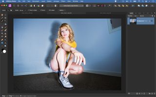
Composite photographs made easy! Drop subjects into a new scene in Affinity Photo
Master basic composite skills in Affinity Photo to cutout and transport your subject into an entirely new location
Watch video: Easy composite photographs in Affinity Photo
Compositing is one of the tasks that the ever-popular Affinity Photo does best. With a few simple skills, we can cutout our subject and transport them anywhere we like – but there are a few important factors to consider for a successful composite.
The first is your initial subject selection. We begin by making a precise cutout using selection tools. The best place to start is usually Affinity Photo’s Selection Brush, which has a ‘Snap to Edges’ setting that enables us to quickly isolate a person.
It helps if the subject is photographed against a plain backdrop like a wall, sheet or any other surface that contrasts with them, as this makes it easier for the tool to snap onto the edges. After, we can enhance the selection using the Refine Selection command. This is a must for improving the tricky parts of the cutout, like hair.
When our initial cutout is complete, we move on to the task of fitting it with the backdrop. Not every backdrop will look right, as the perspectives need to (at least roughly) match up. Then we can adjust the backdrop to make the composite more realistic by adding a shadow. Little touches will help to ground the subject in the scenes, which helps to sell the effect.
Finally, we can make the backdrop slightly out-of-focus by using a blur filter. Get to grips with these techniques and you’ll be able to combine images in all sorts of creative ways. Here's how it's done…
01 Select the subject

Open the portrait starter image here and grab the Selection Brush from the toolbar. Check ‘Snap to Edges’ in the options at the top then paint over the figure. Use the ] and [ keys to resize your brush tip as you paint, and hold Alt to subtract areas if it picks up unwanted details.
02 Improve your selection

Click the Refine button, then increase the Border Width to refine the edge. Use the Matte brush to paint over the edges of the hair and exclude the tricky bits. Use the Foreground and Background brushes to designate any other areas. Set Output: mask and hit Apply.
03 Copy the cutout

Copy the cutout (Cmd/Ctrl + C), then go to the other image and paste (Cmd/Ctrl + V). Use the Move tool to position and resize the layer until it’s where you want it. Next, hold Cmd/Ctrl and click the mask thumbnail to load it as a selection, then make a new pixel layer.
04 Squash the shadow

Drag the new pixel layer below the cut out layer, then go to Edit > Fill to fill it with black. Get the Move tool and drag the top point down to squash the layer, so it looks like a shadow. Add a layer mask and paint black to fade out the top of the shadow and hide unwanted areas.
05 Blur the backdrop

Filter > Blur > Gaussian Blur to fade the shadow a bit. We can also blur the backdrop. Highlight the bottom layer, then go to Layer > Live Filter Layer > Blur > Depth of field. Set Mode: Tilt-Shift, then adjust the centre point to sit over the feet. Increase Radius to blur the backdrop.
06 Skew the colors

A tonal change will help this all mesh. Highlight the top layer, then click the Adjustment icon and choose Curves. Go to the Blue curve channel and drag the bottom point upwards to add blue into the shadows. Drag the top point down to add yellow to the highlights.
PhotoPlus: The Canon Magazine is the world's only monthly newsstand title that's 100% devoted to Canon, so you can be sure the magazine is completely relevant to your system.
Read more:
The best photo editing software: image editors for novices through to pros
The best photo-editing laptops: top laptops for photographers
10 best online photography courses – from beginner guides to masterclasses
Get the Digital Camera World Newsletter
The best camera deals, reviews, product advice, and unmissable photography news, direct to your inbox!
The lead technique writer on Digital Camera Magazine, PhotoPlus: The Canon Magazine and N-Photo: The Nikon Magazine, James is a fantastic general practice photographer with an enviable array of skills across every genre of photography.
Whether it's flash photography techniques like stroboscopic portraits, astrophotography projects like photographing the Northern Lights, or turning sound into art by making paint dance on a set of speakers, James' tutorials and projects are as creative as they are enjoyable.
He's also a wizard at the dark arts of Photoshop, Lightroom and Affinity Photo, and is capable of some genuine black magic in the digital darkroom, making him one of the leading authorities on photo editing software and techniques.

