Steven Holl Architects' dramatic expansion design for The Museum of Fine Arts in Houston

The city of Houston might be famously associated with the solving of tricky astronautical problems, but as of today, it's forging a new artistic legacy. The Museum of Fine Arts in Houston has unveiled its plans for a dramatic redevelopment of its 14-acre campus by Steven Holl Architects. With three-quarters of its funding already secured - that's a whopping $330 million of its total $450 million goal - the institution revealed a unifying master plan that will see the construction of a new art school and museum building, complemented by a cutting-edge conservation centre by Lake Flato Architects.
The new structures will blend harmoniously with the campus' existing iconic buildings by Mies van der Rohe, Rafael Moneo, William Watkin, and a sculpture garden by Isamu Noguchi. It will break ground in the coming months and is expected to complete in 2019.
Speaking during the unveiling of the museum's plans, architect Steven Holl said, 'When I look at the whole project, I think it's probably the most important project that I will ever do as an architect. I'm very grateful to have this opportunity. It's not just a building. It's a campus and a public space that's enormously important for the city of Houston.'
The redevelopment of the museum complex has been a long time in the making. Back in 2012, Steven Holl Architects beat out two other practices to win over the museum's directors and board of trustees with a proposal that completely reorientated the brief that its entrants were set.
The original plan tasked architects to include a multi-storey car park in their design proposal, which Holl promptly ignored. 'When I first presented to [the museum], they asked me, 'Well, where's the parking garage?' There isn't any,' he laughed. "And that was the first thing that was supposed to be built. I think that's why we won. It was hard for [the museum] at first because it was breaking the rules of the competition, but over time they realised that was the way to go.'
No stranger to shaping museums or educational institutions, Holl's vision expands the campus and turns it into an integrated place that the community can also experience. It will provide increased pedestrian access with public plazas, gardens and reflecting pools, and improved sidewalks to facilitate circulation in the new complex.
His design for the new Nancy and Rich Kinder Building - a 164,000 sq ft museum for exhibiting 20th and 21st century art, is a translucent glass tube structure, punctuated by seven vertical gardens around its perimeter that will bring a sense of its surroundings indoors. A concave curved canopy, which Holl imagined as the imprints of Texas' big sky and clouds on the roof's surface, allows light to gently filter through to the 25 galleries inside in an organic way. Soft and fluid in contrast to the stone Moneo building and van der Rohe's steel and glass construction close by, Holl's design will hold its own.
On the other hand, his practice's vision for the new Glassell School of Art building is formed by a series of sandblasted concrete panels, placed at dynamic verticals and angles. The L-shaped construction features a ramped amphitheatre that leads up to a walkable rooftop garden, where visitors can enjoy dramatic views of the newly unified campus. In addition to opening onto Noguchi's sculpture garden and providing added outdoor space for programs and performances, the 80,000 sq ft building also sits atop an extensive underground parking garage. Putting two layers of parking underground allowed not only to not build a parking garage, but also to expand the sculpture garden.
The Glassell School of Art building marks the first phase of the master plan and will begin construction in August. 'With this project, I'm making architecture, social space and public space that's so large, it's shaping urban life and the nature of the city,' says Holl. 'The city is the greatest human artefact. One of the wonderful aspects of being an architect is that every once in a while you get a chance to work on the scale of a city. It's the accumulation of these pieces that makes something special.'
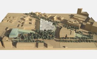
The institution revealed a unifying master plan that will see the construction of a new art school and museum building, complemented by a cutting-edge conservation centre by Lake Flato Architects
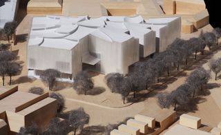
Steven Holl's design for the new Nancy and Rich Kinder Building - a 164,000 sq ft museum for exhibiting 20th and 21st century art, is a translucent glass tube structure
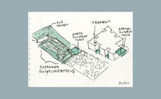
The structure will be punctuated by seven vertical gardens around its perimeter that will bring a sense of its surroundings indoors
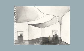
A watercolour of the building's third floor galleries
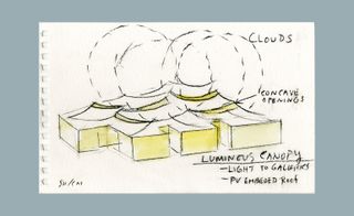
A concave curved canopy tops the Nancy and Rich Kinder Building, which Holl imagined as the imprints of Texas' big sky and clouds on the roof's surface, allows light to gently filter through to the 25 galleries inside in an organic way
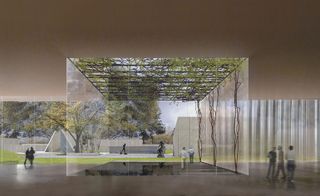
Soft and fluid in contrast to the stone Moneo building and van der Rohe's steel and glass construction close by, Holl's design will hold its own
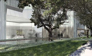
It will provide increased pedestrian access with public plazas, gardens and reflecting pools...
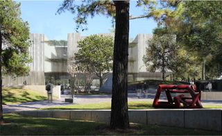
...and improved sidewalks to facilitate circulation in the new complex
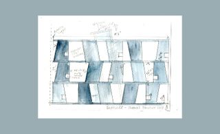
On the other hand, his practice's vision for the new Glassell School of Art building is formed by a series of sandblasted concrete panels, placed at dynamic verticals and angles
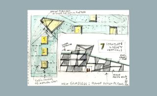
The L-shaped construction features a ramped amphitheatre that leads up to a walkable rooftop garden, where visitors can enjoy dramatic views of the newly unified campus. The architect explains of his working watercolour sketches, 'Everyday, I work for 1-2 hours in the morning on a 5"x7" pad. It's a very efficient way to communicate what the basic ideas are'
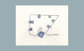
'I can have a concept and write it in words, but I can also show a space, a geometry, texture and which way the light is coming,' he adds. 'All these things can be communicated in a very small drawing'
ADDRESS
1001 Bissonnet
Houston
Texas 77005
United States
Wallpaper* Newsletter
Receive our daily digest of inspiration, escapism and design stories from around the world direct to your inbox.
Pei-Ru Keh is a former US Editor at Wallpaper*. Born and raised in Singapore, she has been a New Yorker since 2013. Pei-Ru held various titles at Wallpaper* between 2007 and 2023. She reports on design, tech, art, architecture, fashion, beauty and lifestyle happenings in the United States, both in print and digitally. Pei-Ru took a key role in championing diversity and representation within Wallpaper's content pillars, actively seeking out stories that reflect a wide range of perspectives. She lives in Brooklyn with her husband and two children, and is currently learning how to drive.
-
 The best design-led cocktail shakers
If you like your drinks shaken not stirred, these are the best cocktail shakers to take your mixology skills to the next level
By Rosie Conroy Published
-
 Tech Editor, Jonathan Bell, selects six new and notable Bluetooth speaker designs, big, small and illuminating
These six wireless speakers signal new creative partnerships and innovative tech approaches in a variety of scales and styles
By Jonathan Bell Published
-
 As London’s V&A spotlights Mughal-era design, Santi Jewels tells of its enduring relevance
‘The Great Mughals: Art, Architecture and Opulence’ is about to open at London’s V&A. Here, Mughal jewellery expert and Santi Jewels founder Krishna Choudhary tells us of the influence the dynasty holds today
By Hannah Silver Published
-
 Light, nature and modernist architecture: welcome to the reimagined Longwood Gardens
Longwood Gardens and its modernist Roberto Burle Marx-designed greenhouse get a makeover by Weiss/Manfredi and Reed Hildebrand in the US
By Ian Volner Published
-
 A bridge in Buffalo heralds a new era for the city's LaSalle Park
A new Buffalo bridge offers pedestrian access over busy traffic for the local community, courtesy of schlaich bergermann partner
By Amy Serafin Published
-
 Tour this Bel Vista house by Albert Frey, restored to its former glory in Palm Springs
An Albert Frey Bel Vista house has been restored and praised for its revival - just in time for the 2025 Palm Springs Modernism Week Preview
By Hadani Ditmars Published
-
 First look: step inside 144 Vanderbilt, Tankhouse and SO-IL’s new Brooklyn project
The first finished duplex inside Tankhouse and SO-IL’s 144 Vanderbilt in Fort Greene is a hyper-local design gallery curated by Brooklyn studio General Assembly
By Léa Teuscher Published
-
 Tour Ray's Seagram Building HQ, an ode to art and modernism in New York City
Real estate venture Ray’s Seagram Building HQ in New York is a homage to corporate modernism
By Diana Budds Published
-
 Populus by Studio Gang, the ‘first carbon positive hotel in the US’ takes root in Denver
Populus by Studio Gang opens in Denver, offering a hotel with a distinctive, organic façade and strong sustainability credentials
By Siska Lyssens Published
-
 This Californian home offers the unexpected through ‘deconstructed’ desert living
Gardens & Villas, a home in La Quinta, California, brings contemporary luxury to its desert setting through a collaboration between architects Andrew McClure and Christopher McLean
By Ellie Stathaki Published
-
 First look inside 62 Reade Street, a clock factory turned family home
62 Reade Street, a boutique New York residential project by architects ODA, unveils its first apartment interior, styled courtesy of Hovey Design
By Ellie Stathaki Published