Alpine lines: rare Otl Aicher prints reveal a graphic designer ahead of his time

For Patrick Eley, creative director of design studio dn&co, German graphic designer Otl Aicher has long been a source of inspiration. ‘His work, particularly that of the Munich 1972 Olympics, is a design touchstone for us,’ Eley explains. ‘But his work for Isny im Allgäu is relatively little known.’
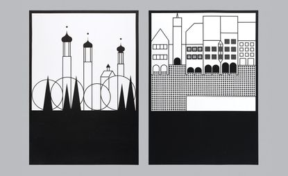
Forty years ago, the small town in southern Germany approached Aicher to create a graphic identity for its tourist board. The designer answered with a kit of 128 monochrome pictograms, in a project Eley considers to be miles ahead of its time.
And so Eley and his studio took a trip through southern Germany to blow the dust from the rare pictograms, uncovered from a ‘treasure trove of an archive’ for a new exhibition at the London Design Festival. The journey was, describes Eley, ‘the epitome of a busman’s holiday’. He was greeted by the generous hospitality of Aicher’s son Florian, and the ‘sweet beauty’ of the town itself. Both were stops along the way to a greater understanding of the man and his vision.

View of Isny, Germany
Isny, surrounded by bucolic scenery – grazing cows and charming farm houses in the foothills of the Alps – has a village feel. Aicher distills this pastoral world into a series of square landscapes, reminiscent of Polaroids, with a concrete-toned urban edge. Steeples, hillsides, forests and a curled up fox are all rendered starkly, with ‘an economy of line drawn with a mischievous twist’.
Despite their reductive aesthetic, they speak to Isny’s atmosphere. ‘Even driving into Isny, you realise the town feels familiar from Aicher’s work – you recognise its landmarks and landscapes,’ Eley offers. ‘The pictures act as vignettes, or a graphic novel, telling a comprehensive story of the place.’
Much of the studio’s own work concerns places and how to best represent them – something they were keen to express through this exhibition. ‘It explores how the pictograms work on their own and in combination with one another. It’s only when you see so much of the work in one place and in its original form, that you are able to appreciate the system Aicher created,’ Eley explains. ‘It’s flexible, playful and endlessly energetic.’

Otl Aicher’s Isny pictograms, 1960s
Viewed against the backdrop of the London Design Festival’s superfluity of far-reaching and futuristic works, Aicher’s illustrative card system seems strikingly contemporary. ‘He created a world that can be ordered and re-ordered; a system that can tell the changing stories of a place panel by panel, while remaining entirely recognisable and consistent’ – like a physical version of a Pinterest or Instagram feed.
It’s clever stuff. But Aicher’s branding programme wasn’t without controversy. About ten years after its introduction, there was an ‘outcry’ from people within the town, who felt they didn’t identify with the black and white portrayal. ‘Surrounding towns were all employing identical tourism campaigns — blue skies and the Apline ideal,’ recalls Eley. ‘The entire system was pulled in favour of something more generic.’
Little by little since the 1990s, the town has been reintroducing and reappreciating Aicher’s forward-thinking work. ‘Today, you really get a sense that it has been embraced once again,’ says Eley. ‘It backs up the universal truth that some of the best ideas are the ones that make us feel most uncomfortable at first.’

Aicher designed a series of 128 monochrome pictograms for the German town of Isny im Allgäu

Steeples, hillsides, forests and a curled up fox are all rendered with ‘an economy of line drawn with a mischievous twist’

The exhibition explores how the pictograms work on their own and in combination with one another
INFORMATION
‘Otl Aicher: Isny’ is on view until 24 September. For more information, visit the dn&co website
ADDRESS
Ground Floor Space
3 Tyers Gate
London SE1 3HX
Wallpaper* Newsletter
Receive our daily digest of inspiration, escapism and design stories from around the world direct to your inbox.
Elly Parsons is the Digital Editor of Wallpaper*, where she oversees Wallpaper.com and its social platforms. She has been with the brand since 2015 in various roles, spending time as digital writer – specialising in art, technology and contemporary culture – and as deputy digital editor. She was shortlisted for a PPA Award in 2017, has written extensively for many publications, and has contributed to three books. She is a guest lecturer in digital journalism at Goldsmiths University, London, where she also holds a masters degree in creative writing. Now, her main areas of expertise include content strategy, audience engagement, and social media.
-
 Leica Cine Play 1 brings premium style and tech to the world of home cinema
Leica compresses its meticulous optic know-how into the ultra-compact Cine Play 1 4K projector
By Jonathan Bell Published
-
 Welcome to the party: the Wallpaper* Entertaining Issue is on sale now
Welcome to the December 2024 Wallpaper* Entertaining Issue: from haute hosting to decadent dressing and a rendez-vous with Italy's powerhouse design families
By Bill Prince Published
-
 Design Dynasties: the powerhouse families of Italian furnishing
We profile the powerhouse families of Italian furnishing, uncovering the secrets of their legacies and stamina
By Laura May Todd Published
-
 Doc'n Roll Film Festival makes its loud return to the UK
The 11th edition of the Doc'n Roll Film Festival celebrates music, culture and cinema from around the world
By Smilian Cibic Published
-
 Preview the Jameel Prize exhibition, coming to London's V&A, with a focus on moving image and digital media
The winner of the V&A and Art Jameel’s seventh international award for contemporary art and design inspired by Islamic tradition will be showcased alongside shortlisted artists
By Smilian Cibic Published
-
 Genesis Belanger is seduced by the real and the fake in London
Sculptor Genesis Belanger’s solo show, ‘In the Right Conditions We Are Indistinguishable’, is open at Pace, London
By Emily Steer Published
-
 Francis Bacon at the National Portrait Gallery is an emotional tour de force
‘Francis Bacon: Human Presence’ at the National Portrait Gallery in London puts the spotlight on Bacon's portraiture
By Hannah Silver Published
-
 Frieze Sculpture takes over Regent’s Park
Twenty-two international artists turn the English gardens into a dream-like landscape and remind us of our inextricable connection to the natural world
By Smilian Cibic Published
-
 Meet Oluwole Omofemi and Bayo Akande, the founders creating a new art community
Oluwole Omofemi and Bayo Akande, are behind Piece Unique, an artist agency that guides and future-proofs emerging artists’ careers
By Mazzi Odu Published
-
 Don’t miss these artists at 1-54 Contemporary African Art Fair 2024
As the 1-54 Contemporary African Art Fair returns to London (10-13 October 2024), here are the artists to see
By Gameli Hamelo Published
-
 Es Devlin’s large-scale choral installation celebrates London’s displaced population
Es Devlin has partnered with UK for UNHCR on a free and open-to-all exhibition, ‘Congregation’, in London from 3-9 October 2024
By Hannah Silver Published