Blue Green Works's lighting champions a new aesthetic in American design
Manhattan-based design studio Blue Green Works fuses sensuality and masculinity to create mellow, mood-enhancing lighting with visual impact

Despite not having any formal design training, Peter B Staples is an industry veteran, having previously worked for the likes of design gallery The Future Perfect and design studio Apparatus. His intuitive understanding of how design and lighting functions in the real world is what led him to set up Blue Green Works in 2020 with business partner James McAvey - both part of the Wallpaper* USA 300.
Blue Green Works: lighting designs with simplicity and purity

Peter B Staples, co-founder and creative director of Blue Green Works, and Alex Smith, the brand’s head of operations, in their Manhattan studio, with pieces from their sophomore lighting collection, including ‘Candle’ and ‘Trophy’, both in floor and table forms, alongside ‘Fiber’ sconces from their debut collection
The Manhattan-based studio has been steadily championing a new aesthetic in American design, becoming known for its sensual yet masculine approach to form – a signature it established with the debut of its ‘Palm’ and ‘Fiber’ lighting fixtures in 2021, inspired by Horace Gifford’s modernist Fire Island homes and completely designed and engineered during lockdown.
‘I’ve always been interested in design. I grew up in a Gustav Stickley house in Illinois and my parents collected his furniture, so I was exposed to design at a really young age,’ says Staples. ‘I studied cinematography and film theory, so I come to this with many different influences. I’m primarily interested in culture, and I’m looking to connect in a larger conversation about aesthetics outside of design. It’s more about a vibe for me.’

Detail of the ‘Candle’ lamp
In Blue Green Works’ sophomore collection, Staples has derived the forms by contemplating symbols of power. ‘Trophy’ riffs on a recognisable goblet shape by elevating it in frosted glass; ‘Banner’ reimagines the ribbons of classic 1930s and 1940s military tattoos by articulating them in metal; ‘Wood’ nods to a skateboarding half-pipe while teaming it with sharper angles; the disc-like shape of ‘Shade’ is drawn from the cymbals of a drum kit; and ‘Candle’ brings a robust quality to the traditional candelabra.
Staples doesn’t feel held back by his lack of design training. ‘I think I approach designing objects with a kind of freedom, which can be a blessing and a curse,’ he says. ‘Being unconstrained by the rules and dogma of design schools is exciting, though it can also present an engineering challenge. But the work I’m making has a simplicity and purity to it. One constant in the collection is a very clear construction and simple use of materials. I enter what I do with an awareness of the rules, but also a disregard for it.
‘I’m still figuring things out, but it’s becoming more and more clear to me what I’m doing. I make decisions based on my instinct and my interests, and things come to fruition pretty naturally,’ he says, about what characterises the brand. ‘A part of me appreciates being at a stage where I haven’t fully defined things because I’m still exploring. I think my inability to define it might also be related to [not being fully trained in] design myself,’ he laughs. ‘I’m fine with that.’

The ‘Wood’ sconce, a tribute to Staples’ passion for skateboarding
There is a refreshing fluidity in Blue Green Works’ collections that is reflected in its embrace of different materials and colours. Made in collaboration with various American craftspeople, including a New England glass studio, a Pennsylvania wood shop and an upstate New York stainless steel fabricator that specialises in custom-made bicycle frames and motorcycle parts, the collection is underscored by a clarity that results in an innate sensuality.
Wallpaper* Newsletter
Receive our daily digest of inspiration, escapism and design stories from around the world direct to your inbox.
‘There is something sexy about the work in its sense of masculinity, but also in its softness. We’re at a stage where the word ‘masculine’ is complicated to use. But when we as a society start deconstructing things, we can also choose what aspects of that we keep, if any,’ he reflects. ‘There is a masculine sensuality that is intriguing and captivating and people respond to and like. When I think about the sensuality of the work, I think about the mood that the pieces create, how the light interacts with them, and how they can change the atmosphere of the room.’
This article appears in the August 2023 ‘Made in America’ issue of Wallpaper*, available in print, on the Wallpaper* app on Apple iOS, and to subscribers of Apple News +. Subscribe to Wallpaper* today.
Pei-Ru Keh is a former US Editor at Wallpaper*. Born and raised in Singapore, she has been a New Yorker since 2013. Pei-Ru held various titles at Wallpaper* between 2007 and 2023. She reports on design, tech, art, architecture, fashion, beauty and lifestyle happenings in the United States, both in print and digitally. Pei-Ru took a key role in championing diversity and representation within Wallpaper's content pillars, actively seeking out stories that reflect a wide range of perspectives. She lives in Brooklyn with her husband and two children, and is currently learning how to drive.
-
 Three new coffee makers for a contemporary brew, from a casual cup to a full-on branded espresso
Three new coffee makers, from AeroPress, Jura and Porsche x La Marzocco, range from the defiantly manual to the bells and whistles of a traditional countertop espresso machine
By Jonathan Bell Published
-
 Don't miss Luxembourg's retro-futuristic lab pavilion in Venice
As the Venice Biennale enters its last few weeks, catch 'A Comparative Dialogue Act' at the Luxembourg Pavilion
By Amah-Rose Abrams Published
-
 A Berlin park atop an office building offers a new model of urban landscaping
A Berlin park and office space by Grüntuch Ernst Architeken offer a symbiotic relationship between urban design and green living materials
By Michael Webb Published
-
 Brooklyn furniture studio Stillmade unveils its first collaborative design series
Stillmade brings to life the designs of four New Yorkers – Pat Kim, Danny Kaplan, Michele Quan and Mignogna Studio
By Pei-Ru Keh Published
-
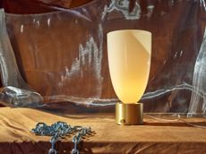 Blue Green Works introduces alluring new lighting collection
Inspired by iconography, American design studio Blue Green Works introduces five new lighting ranges
By Rosa Bertoli Published
-
 Exclusive peek at artfully curated home in Jean Nouvel’s 53 West 53
RR Interiors' latest furnishing project – 61A at 53 West 53 – highlights art, architecture and city views inside Jean Nouvel's monumental New York skyscraper in Midtown Manhattan
By Martha Elliott Last updated
-
 Industrial elements are imbued with elegance in Holly Hunt’s new Los Angeles showroom
Holly Hunt and architects Johnston Marklee have created a warm and tactile space in a 1940s building
By Hannah Silver Last updated
-
 Sculptural ceramic lamps from Brooklyn’s In Common With and Danny Kaplan
‘Terra’, a new collection of ceramic lamps featuring tactile glazes, puts Brooklyn studio In Common With and ceramicist Danny Kaplan in the spotlight
By Pei-Ru Keh Last updated
-
 Sight Unseen launches furniture line with Bestcase
Editorial platform Sight Unseen worked with sheet metal specialist Bestcase to launch a collection of 1970s-inspired furniture in collaboration with Home Studios, Studio Anansi and Thévoz-Choquet
By Pei-Ru Keh Last updated
-
 Roll & Hill and Post Company's lighting designs in Inness are inspired by Georgian bell jars
Brooklyn-based studio Post Company created a new lighting collection for Roll & Hill, inspired by bell jar lanterns and conceived for country refuge Inness
By Pei-Ru Keh Last updated
-
 Trnk refines its namesake furniture collection to spotlight creatives of colour
The reinvigorated Trnk Collection is curated by founder Tariq Dixon and draws from its creative community, including pieces by Studio Anansi, Michael K Chen and Farrah Sit
By Pei-Ru Keh Last updated