Giulio Ridolfo’s latest colour work for Kvadrat is ’like a piece of jazz that you can play in different ways’
Orgatec 2022: Kvadrat expands the Steelcut collection by Giulio Ridolfo, a series of vibrant blends of colours demonstrating the colour maestro’s eclectic sensibility
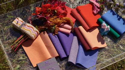
Conversing with Giulio Ridolfo is rather like joining the Italian colour maestro as he saunters around a city or the countryside, using all his senses to fuel his creative process. Ostensibly meeting to talk about three new textiles he has developed for Danish textile company Kvadrat, he meanders, pausing to note a yellow flower on a photo here, listen to a dissonant note there, or admire the layered colours of a Paul Klee painting on a postcard he picked up somewhere. Ridolfo, who trained as a fashion designer before becoming a colour adviser to many leading interiors and fashion companies, draws inspiration from his surroundings, always in analogue. ‘I have to touch things. I have to show you a postcard, I have boxes of them, look at this beautiful nymph from the archaeology museum in Napoli.’
He is such a bower bird, travelling with a seemingly bottomless suitcase to cart his haul home, that he calls himself Mario Poppins. And like the character from the children’s book, there is something magical or alchemical in how he translates mementoes into a realm of colour. ‘To me, work is like a travelogue. I learn by doing, I collect my souvenirs, which I can use or not, I blend stories, I can create mock-ups about a postcard or a piece of leather I bought in Australia. The system of colour to me is nothing, if not compared to other sources.’
Giulio Ridolfo and Kvadrat: the Kvadrat Steelcut collection
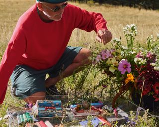
Giulio Ridolfo with samples of the new Steelcut collection for Kvadrat alongside objects that have inspired the colours for the series
Ridolfo has worked with Kvadrat for 15 years. He likes to say that he used his southern European colour sensibility to ‘contaminate’ a company rooted in the design traditions of a region known for its cool Northern light. The relationship began with the first version of Steelcut, developed in 2004 by Dutch master weaver Frans Dijkmeijer, who invited Ridolfo to create the colour palette. The Italian is so embedded within Kvadrat that, when he conducted a workshop at the headquarters in Ebeltoft a few years ago, he timed it for summer solstice so he could weave inspirations from the Sankt Hans celebrations into a new colour range. He makes the point that he doesn’t design textiles, but rather creates colours in the context of the textiles. He believes that colour is nothing without a material, and vice versa.

Steelcut 3 colour wheel
An example of his impact came with Steelcut Trio, launched in 2007, a basketweave construction made up of three threads that has an almost faceted surface. Unlike the original Steelcut, which was piece-dyed (coloured as a whole), Steelcut Trio is yarn-dyed (the individual threads are dyed before weaving), which allowed Ridolfo to bring complex and sophisticated colour effects. His latest iteration, Steelcut Quartet, blends four colours. In musical terms, Trio is a minimal harmonic rhythm by [American minimalist composer] Steve Reich, whereas Quartet is more of a jazz standard, he says. ‘Quartet is the result of a beautiful blending of four yarns with a kind of vibration. The yarns are the same as Steelcut Trio. We only play with more. To me, Quartet is fired by [Canadian jazz composer] Oscar Peterson, a good standard, like a piece of jazz that you can play in different ways.’

To demonstrate his point, he takes a sample of Quartet with a weft (effectively a base note) of purple. It is the dominant tone, used also as a yarn in the warp combined with another thicker one made by twisting three colours into one yarn, creating more vibrancy and nuance. A deeper version with the same purple base is directly inspired by the layering of moody colours in Klee’s Angelus Militans (1940). ‘If you are an artist you can work with layering, you see the colour becomes deeper and deeper when you layer one, two, three, four colours.’

Steelcut Quartet colour wheel
As well as updating the palette of Steelcut to an iteration called Steelcut 3, with 19 new colours, Ridolfo also developed a checked version made out of 100 per cent recycled polyester. Intentionally colouring it in bright, happy hues, Ridolfo called it Beat (to be launched in 2023). The fabric seems to have the effect of synaesthesia on him, he almost taps his feet to the tune he can see in the jaunty checks. ‘It’s like a beat, like a sound,’ he says before rattling off the fabric’s many references, ranging from cotton stripes in Sumatra, to colourful ski suits, the nymph from Naples, and a vintage Hermès foulard in emerald green with a hand-rolled border in chocolate brown. ‘This is only the beginning. There will be many, many colours, big checks, small checks,’ he says, with a faraway look in his eye.
Wallpaper* Newsletter
Receive our daily digest of inspiration, escapism and design stories from around the world direct to your inbox.

Jeni Porter is the founding Editor and now Editor-at-Large of Ark Journal, a Copenhagen-based architecture, art and design magazine. Originally from Sydney, Jeni also writes for a range of international publications and does commissioned editorial-based projects for leading Danish brands.
-
 The best design-led cocktail shakers
If you like your drinks shaken not stirred, these are the best cocktail shakers to take your mixology skills to the next level
By Rosie Conroy Published
-
 Tech Editor, Jonathan Bell, selects six new and notable Bluetooth speaker designs, big, small and illuminating
These six wireless speakers signal new creative partnerships and innovative tech approaches in a variety of scales and styles
By Jonathan Bell Published
-
 As London’s V&A spotlights Mughal-era design, Santi Jewels tells of its enduring relevance
‘The Great Mughals: Art, Architecture and Opulence’ is about to open at London’s V&A. Here, Mughal jewellery expert and Santi Jewels founder Krishna Choudhary tells us of the influence the dynasty holds today
By Hannah Silver Published
-
 Hot metal: why shiny tableware is a holy grail of hosting
From a silvery modernist coffee pot to a perfectly poised stainless-steel candleholder, bring glimmer to dinner with shiny metal tableware
By Bridget Downing Published
-
 Vincent Van Duysen ‘inspired by modernism’ for Molteni & C’s outdoor furniture debut
Molteni & C goes alfresco with two new collections and reissued classics, bringing its signature elegance to the great outdoors
By Rosa Bertoli Published
-
 First look inside Centurion New York by Yabu Pushelberg
Centurion New York is an expansive new space for American Express’ ‘black card’ members. Its interior designers Yabu Pushelberg give us a tour
By Tilly Macalister-Smith Published
-
 Is this the most beautiful office in the world?
Parisian creative agency Art Recherche Industrie’s new HQ translates a 19th-century landmark into a chic open-plan office worth leaving home for
By Rosa Bertoli Published
-
 Designer James Shaw’s latest creation is a self-built home in east London
James Shaw's east London home is Filled with vintage finds and his trademark extruded plastic furniture, a compact self-built marvel
By Rosa Bertoli Published
-
 Taschen tantalises with new edition of Jorge Pardo’s ‘Brussels Lamps’
German publishing house Taschen launches a limited-edition series of five ‘Brussels Lamps’ by Cuban-American artist Jorge Pardo
By Rosa Bertoli Published
-
 Edra’s outdoor furniture is an ode to the sea
Designed by long-term collaborator Jacopo Foggini, the ‘A’mare’ collection of outdoor furniture mimics shiny water, and was named 'Best Disappearing Act' at the Wallpaper* Design Awards 2023
By Rosa Bertoli Published
-
 Peep inside Luca Nichetto’s Pink Villa in Stockholm, part studio, part showroom
Welcome to the pink house that is the new Stockholm home to Luca Nichetto's team
By Maria Cristina Didero Published