Breitling and Triumph unite on a racy new watch and motorcycle
1960s design codes are infused with a contemporary edge in the collaboration between Breitling and Triumph

Breitling and British motorcycling brand Triumph have united on a collaboration that celebrates the heritage of both brands. The newly unveiled Top Time watches and Speed Twin motorcycle take their design cues from the chic motorcycles that epitomised 1960s café-racer culture, so called as the motorcycles were used to ferry their riders from café to café.
For Breitling, this freewheeling spirit was encapsulated in the relaxed proportions and graphic dial design of the Breitling Top Time, first released in the same decade and whose sporty spirit is now rethought in the new Top Time collaboration pieces. ‘For this modern Top Time Triumph, we opted for a more minimalist case, but brought back some of the Top Time’s most distinctive design features,’ says Breitling creative director Sylvain Berneron. ‘For example, there is the bow-tie motif, known as the “Zorro dial” by collectors, and the half-square, half-circle (aka “squircle”) counters.’

The distinctive brushed finish of the Zorro dial, which first appeared on the Top Time Ref. 2003 watch in the 1960s, originally possessed contrasting colours, such as black on white. ‘Because this Triumph edition is, at its core, a tool watch for reading speeds and timing events, the emphasis had to be on the tachymeter rehaut and the chronograph counters,’ adds Berneron of this reinterpreted watch design. ‘This led us to develop a more subtle, tone-on-tone Zorro dial plate created with an alternately brushed and polished finish.’
These historical design codes are brought up to date with the addition of a new, contemporary icy blue hue. ‘From our very first discussions with the Triumph team, we knew we wanted an exotic dial colour to make the collaboration truly special and unique – but that colour also had to have significance to both brands,’ says Berneron. ‘This ice blue is directly linked to a Triumph Thunderbird 6T from 1951, which came in a beautiful polychromatic blue, a colour that has rarely been used by Triumph since. Triumph was able to extract a mint-condition paint chip to recreate the colour. Breitling, meanwhile, has an extremely rare, ice-blue-dialled Top Time Ref. 815 from the 1970s in its archives of nearly the identical shade. So this dial plate alone is a strong link between both brands. The combination of this colour and the Zorro design creates a very contemporary, graphic and yet subtle look, which we fell in love with the moment we received the first prototypes.’


INFORMATION
breitling.com
Wallpaper* Newsletter
Receive our daily digest of inspiration, escapism and design stories from around the world direct to your inbox.
Hannah Silver is the Art, Culture, Watches & Jewellery Editor of Wallpaper*. Since joining in 2019, she has overseen offbeat design trends and in-depth profiles, and written extensively across the worlds of culture and luxury. She enjoys meeting artists and designers, viewing exhibitions and conducting interviews on her frequent travels.
-
 Three new coffee makers for a contemporary brew, from a casual cup to a full-on branded espresso
Three new coffee makers, from AeroPress, Jura and Porsche x La Marzocco, range from the defiantly manual to the bells and whistles of a traditional countertop espresso machine
By Jonathan Bell Published
-
 Don't miss Luxembourg's retro-futuristic lab pavilion in Venice
As the Venice Biennale enters its last few weeks, catch 'A Comparative Dialogue Act' at the Luxembourg Pavilion
By Amah-Rose Abrams Published
-
 A Berlin park atop an office building offers a new model of urban landscaping
A Berlin park and office space by Grüntuch Ernst Architeken offer a symbiotic relationship between urban design and green living materials
By Michael Webb Published
-
 Samuel Ross unveils his Hublot Big Bang watch design
Samuel Ross brings a polished titanium case and orange rubber strap to the Hublot Big Bang watch
By Pei-Ru Keh Published
-
 Playful design meets chic heritage in the Hermès Kelly watch
The new Kelly watch from Hermès rethinks the original 1975 timepiece
By Hannah Silver Last updated
-
 Discover the tonal new hues of the classic Nomos Club Campus watch
The Nomos classic wristwatch Club Campus now comes in two new collegiate colours. The perfect graduation gift from the Glashütte manufacture
By Hannah Silver Last updated
-
 Bulgari unveils the thinnest mechanical watch in the world
The new Bulgari Octo Finissimo Ultra watch is a record-breaking feat of engineering
By Hannah Silver Last updated
-
 Gerald Genta’s mischievous Mickey Mouse watch design is rethought for a new era
The Gerald Genta Retrograde with Smiling Disney Mickey Mouse watch pays tribute to Genta’s humorous design codes
By Hannah Silver Last updated
-
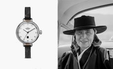 Shinola honours Georgia O’Keeffe with a new watch
Shinola Birdy watch stays faithful to the minimalist codes of Georgia O’Keeffe’s painting, My Last Door
By Hannah Silver Published
-
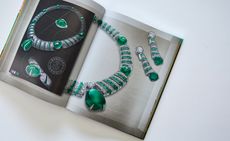 Bulgari’s new book celebrates women and high jewellery
Bulgari Magnifica: The Power Women Hold, published by Rizzoli New York, takes a closer look at the female muses who inspired the spectacular Magnifica high jewellery collection
By Hannah Silver Last updated
-
 Tom Ford unveils minimalist third watch collection
This clean and elegant new watch collection, N°003, is the latest from Tom Ford Timepieces
By Hannah Silver Last updated