Rado partners with Les Couleurs Le Corbusier

Left, True Thinline Les Couleurs Le Corbusier Slightly Greyed English Green – 32041, from the 1931 edition of Le Corbusier’s Architectural Polychromy palette, is infused with a hint of blue. Right, True Thinline Les Couleurs Le Corbusier Iron Grey – 32010 is the darkest shade of Le Corbusier’s first Architectural Polychromy palette, published in 1931.
Rado’s collaborations with Jasper Morrison and Konstantin Grcic resulted in two of the Swiss watch brand’s most notable contemporary watch designs. Now, it is taking its design-partnership credentials one step further – albeit with a backwards glance.
Rado’s just-announced association with Les Couleurs Suisse, protecting body of Le Corbusier’s Architectural Polychromy, promises to be a harmonious one. That the architect-designer hails from the world’s horological heartland is a tidy link. That Rado has immersed itself in the exploration of colour theory since it started experimenting with high-tech ceramic in the 1990s adds up to a genuinely creative one.
Back then, the process of creating wearable products in a material commonly used by the aerospace industry for its toughness and heat resistance was a high-risk business requiring huge investment in special machinery. Attempts at introducing colour beyond achieved black and white tones proved almost impossible, due to the inconsistency of pigment in the extremely high-temperature ceramic production process.
Over the past 30 years, Rado has become a master alchemist, relentlessly experimenting until tonal ceramic shades, such as grey and brown, became possible.
The launch of the True Thinline Les Couleurs Le Corbusier – a monochromatic ceramic watch collection created in nine of the Architectural Polychromy shades – marks a milestone in horological achievement. The results, though hard to convey in an image – particularly the subtlety of the achieved tones – are seriously impressive.
As with the ceramic technology, working with Les Couleurs Suisse added a further layer of process. ‘We had been experimenting with prototype colours for 10 years before going to see them,’ says Matthias Breschan, Rado CEO. ‘They took one look and said, “No”.’
At that point the prototypes were shiny – ‘the light was all over the place,’ recalls Breschan. ‘So we tried it on matt ceramic, which absorbed the light, and went back to see them. That was the starting point.’ The next two years involved much back and forth and trial-and-error. But, as Breschan points out. ‘It was Les Couleurs Suisse who were always in charge of the colours.'

Left, True Thinline Les Couleurs Le Corbusier Luminous Pink 4320C, from the 1959 series is the ultimate pop colour. Right, True Thinline Les Couleurs Le Corbusier Spectacular Ultramarine – 4320K is one of the dynamic shades of the 1959 series of Le Corbusier’s Architectural Polychromy palette.
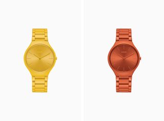
Left, True Thinline Les Couleurs Le Corbusier Sunshine Yellow – 4320W, from the 1959 dynamic colour series, is the only yellow shade in the Polychromy. Right, True Thinline Les Couleurs Le Corbusier Powerful Orange 4320S, from the 1959 series, is a basic, optimistic shade suited to larger surfaces.
INFORMATION
For more information, visit the Rado website and the Les Couleurs Le Corbusier website
Wallpaper* Newsletter
Receive our daily digest of inspiration, escapism and design stories from around the world direct to your inbox.
Caragh McKay is a contributing editor at Wallpaper* and was watches & jewellery director at the magazine between 2011 and 2019. Caragh’s current remit is cross-cultural and her recent stories include the curious tale of how Muhammad Ali met his poetic match in Robert Burns and how a Martin Scorsese Martin film revived a forgotten Osage art.
-
 10 books culture editor Hannah Silver recommends this winter
Lacking inspiration over what to read next? Wallpaper* culture editor, Hannah Silver, shares her favourite books
By Hannah Silver Published
-
 Midtown Manhattan restaurant Ánimo! takes its cues from Mexican morning rituals
Designer Jordana Maisie creates a minimalistic yet referential setting for Ánimo!
By Adrian Madlener Published
-
 First look: Leica Cine Play 1 brings premium style and tech to the world of home cinema
Leica compresses its meticulous optic know-how into the ultra-compact Cine Play 1 4K projector
By Jonathan Bell Published
-
 Why are watch designers so drawn to brutalism?
Watch brands looking for ways to break the conservative mould look to brutalist architecture and 1970s design codes
By James Gurney Published
-
 Classic watch designs to last a lifetime
When considering which watch design to invest in, disregard trends and consider classic pieces characterised by timeless design
By Hannah Silver Last updated
-
 Browns and Mad Paris rethink Audemars Piguet Royal Oak
Watch customisation specialist Mad Paris has developed two new versions of the Audemars Piguet Royal Oak for Browns
By Hannah Silver Last updated
-
 Time for an eco-friendly watch?
Some of the more eco-friendly watch materials being embraced by sustainably-minded watchmakers include recycled steel, bioceramic and cork
By Hannah Silver Last updated
-
 Boundary-breaking Chanel watch is tweaked for a new generation
The Boy.Friend Skeleton appeals to both men and women with its distinctive octagonal silhouette
By Hannah Silver Last updated
-
 On the button: Chanel's perfectly hidden timepiece
The ‘Mademoiselle Privé Bouton’ watch is everything but off the cuff
By Hannah Silver Last updated
-
 Sound bite: Jaeger-LeCoultre’s contemporary art celebrates acoustic watches
Jaeger-LeCoultre and Swiss artist Zimoun have collaborated on an artwork to commemorate the 150 year anniversary of its first minute repeater
By Hannah Silver Last updated
-
 Kengo Kuma’s studio for Grand Seiko sits in the shadow of Mount Iwate
The Grand Seiko Studio Shizukuishi takes the natural world as its inspiration
By Hannah Silver Last updated