The Movano Evie smart ring landed earlier in 2024, and promised personalised and holistic approach to women's health monitoring.
Evie was first unveiled at CES 2023 and Wareable got hands-on at CES 2024 – ahead of a full review sample in March.
We’ve followed its development along the way – excited about a smart ring that promised better, smarter insights for women. But from our testing, that’s not really what we found.
Frustratingly, we had to cut testing short due to issues with syncing, which Movano has told us: “sounds like a battery malfunction.”
A promised replacement sample did not arrive, and our review has been in stasis since April.
But having written about Evie extensively, it’s important that Wareable is up front about our problematic experiences, which extend beyond battery problems to issues with the design and features.
While the Evie Ring is a promising start, there are drawbacks. This isn’t our full and final review – but anyone considering Evie should read this first. Here’s what we found:
Best smart rings from our reviews
Technical issues
Testing with Evie was all going well until I opened the app and saw no data had synced for the past day. The sensors were still lighting up so I thought the ring was still working. But I tried charging and it wouldn’t sync. That’s when I contacted Movano.
And I’m not the only one to have problems. The Evie subreddit reveals that many users have had issues with the Evie’s battery life, and similar syncing issues. In fact, Evie users have been in touch with Wareable to complain that their ring stopped working after purchase.
We hope to test more of the features when we get our hands on a replacement ring. But these issues seem too prevalent to go un-reported.
Design drawbacks
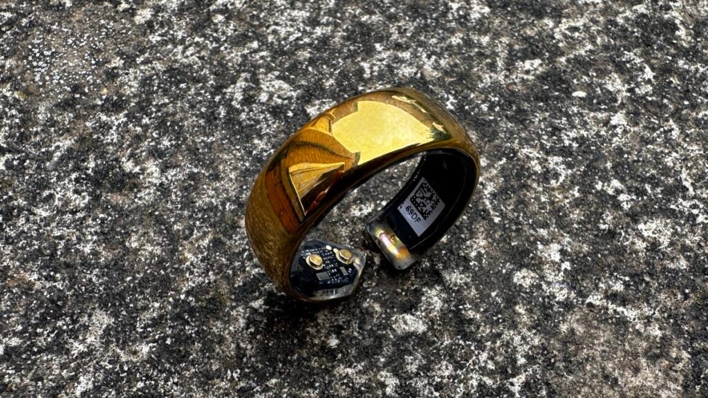
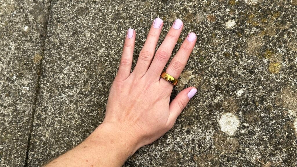
The Movano Evie has a similar design to other smart rings on the market. It comes in rose gold, gold and silver shades and looks like chunky jewellery. I’ve seen other reviewers say the Evie is slim, but it looked a little bulky on my finger – especially compared to other smart rings that I’ve tested.
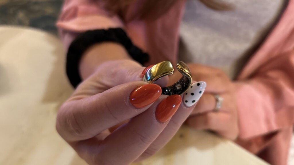
One major difference between Evie and other rivals is that the design isn’t fully closed. There’s a small notch or gap in the interior of the ring, meant to be worn facing your palm. Not only does this make the ring look more interesting, I’ve seen other reviewers say it’s a welcome design choice as it better accommodates their finger when their hands swell throughout the day or over the course of the month.
But personally, I’ve tested most of the major smart ring brands now and haven’t experienced swelling that stops a ring from fitting, so I feel like that could be a dealbreaker for some people but not everyone. If anything the gap made the ring a little more awkward for me to wear as the small opening got caught on clothes and my hair several times.
The ring weighs only 3.2g, which is similar to other devices from Ultrahuman and Ringconn, and feels incredibly light to wear but a little plasticky and cheap. Even with the correct size it did stick out from my finger a little more than rival brands, which was due to the general design and the way the sensors protrude from the ring.
The interior was also a little less comfortable against my skin. Sensors inside were smoothed over but I could feel them really obviously. However, I know that doesn’t have to be the case. For example, the Ultrahuman Ring Air has a smooth hypoallergenic coating on the inside.
Simplistic cycle tracking
The Movano Evie promises to paint a holistic picture of your overall health and wellbeing, taking into account your sleep, movement, heart rate data, SpO2, temperature and more.
The Evie promises to do things a bit differently as it’s marketed at women. But I found its feature set way short of what’s already out there.
Other brands, like Oura, already have menstrual tracking features built-in. And, despite the presence of a temperature sensor here, the Movano Evie ring doesn’t use skin temperature to identify your cycle – as we’ve seen on Apple Watch, Galaxy Watch and Oura Ring. This feels like a big problem when the ring is explicitly aimed at women.
In fact temperature data is weak. It doesn’t look like the app presents temperature so you can see it trending over time either – this would be handy for menstrual cycle tracking. As far as I can tell, the menstrual tracking features look like a run-of-the-mill period tracking app. Unfortunately, due to the battery issues, I didn’t get to put the menstrual cycle prediction and tracking features to the test.
Health metrics analyzed
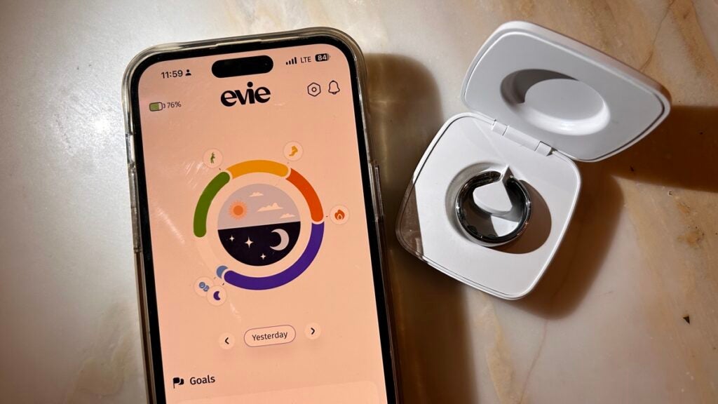
When you open the Evie app you’ll see the home screen called ‘Today’ This is where your progress is visualised as a ring which fills up throughout the day with the core tracking elements of sleep, steps, active minutes and calories. But the way that ring is populated seems a little arbitrary. It doesn’t make sense what the colours are some days and how their weighting was determined.
Next is the ‘My Body’ screen, which is where core metrics, like HRV, respiration, SpO2 and body temperature live. All of the wellness stats you’d expect from a health-focused wearable. There is also a feature to allow you to ‘spot check’ your vitals, but this didn’t work anytime I tried it.
The ‘Sleep’ screen lets you dig deeper into your sleep stats, providing details about sleep stages (called zones here), sleep duration and your vitals as you sleep, like your resting heart rate and respiration rate. Although it’s worth pointing out that some nights the sleep zones were tracked but those vitals weren’t. This was disappointing and meant a lot of mornings I checked the app all I could really see was how long I was asleep for and the zones – interesting at first, but this basic data got boring quickly.
Finally, there’s a journal element. This is where users can log menstrual symptoms as well as their mood and any other symptoms you might want to track alongside your period to see if there are any patterns. Again, this was another part of the Evie experience I began to engage with but didn’t get to explore fully in those first few days of testing.
Evie app – and issues around language
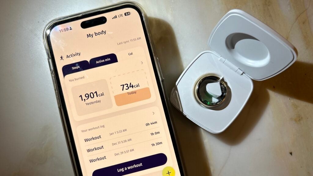
The app’s design is very stripped back. With simple colors, some animations and little images of stylized women. Whether you like that or not will be down to personal preference. I personally felt like it was a bit of a step back from what I’m used to with Oura and Fitbit.
Elements of this design reminded me of the early days of Fitbit and Jawbone, when trackers had colorful apps and animations. This doesn’t seem to be the trend among other fitness apps nowadays, with many brands focusing cohesive data visualizations and comforting color schemes.
Some people might be happy to hear there aren’t any graphs here, but that means that it looks like there’s a lack of trending data – vital for seeing patterns over time – but it’s too early to tell if those insights might be revealed later with further use.
Some of the explainers and wording within the app were a personal bugbear of mine too. For example, on hitting a step goal the home screen displayed “woohoo” and on getting a good night’s sleep, “sweet”. The wording felt patronizing to me, especially after seeing the more serious tone of Oura and Ultrahuman’s app, which I preferred.
Then again, other people I showed the app to said they liked it and found it fun and motivating.
Which makes me think whether you like the Movano Evie or not is largely going to depend on what you’re looking for. Motivation with a light touch, you’ve got that here. An advanced app experience capable of competing with the likes of Oura or advanced fitness tech, no.
It’s worth mentioning here that there’s no way to track workouts. This is quite standard in smart rings, there’s usually an element of having to add them manually or import them from elsewhere.
But other brands overcome this hurdle better. At the time of writing there’s no Apple Health integration, so workouts can’t come from there. Instead, you need to add them to the app. But this feels clunky and you can’t tag what the workout was – just that you were active and how long for.
Battery life and charging
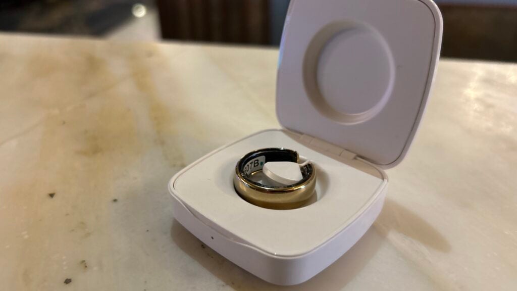
Movano promises 4 days of battery life and I found I got around 3-4 days from it. Again, I didn’t get to test this much due to the tech issues I encountered.
There wasn’t a notification to say that the battery was nearly out, which was disappointing and meant there was an instance of not collecting data one day.
The Movano Evie ring comes with a small clamshell-like charging case. This has a plasticky feel, but I liked the size. It’s a handy, pocketable shape. Movano says the case contains about ten ring charges, but the ring stopped working before I could test out whether that delivers. This means you could easily go on holiday with the case and not need to plug it in for the entire time you’re away.
Early verdict
The Movano team told us they’d be sending a replacement ring soon – but that was on 25 April. Testing a new ring for longer should “unlock” more insights, especially those related to menstrual cycle tracking, which I’m looking forward to seeing for myself.
One of my biggest issues with the Evie isn’t that the app has simplistic and sort of patronizing language and a sparse interface. It’s that it’s marketed to women with all of those things. I don’t like the insinuation that a women’s smart ring doesn’t have the detail and seriousness of one that’s unisex or leaning more towards the male market.
Right now, the Movano Evie ring reminds me of a simple activity tracker for your finger. By that I mean its design feels good but a little bulky and it does a decent (but by no means perfect) job of collecting some data, presenting it in an easy-to-digest way. This is particularly the case when you compare it to other smart rings on the market.
Maybe that’s the problem. The smart ring market is so new it’s easy to see smart rings and start comparing them to one another. Whereas really there are a lot of differences between the latest Oura ring and the Movano Evie ring and they’re aimed at different audiences.
Overall, the Movano Evie ring has promise but doesn’t feel fully finished. It’s not ready to compete with the Oura ring, the Ultrahuman ring or the Ringconn ring. But we’re hopeful that the next version might.
This feels like an experience for a very basic user, with few expectations. But even so – judging on my experiences, and those of Reddit users – there seems to be concerns around reliability that makes Evie Ring too hard to recommend.
