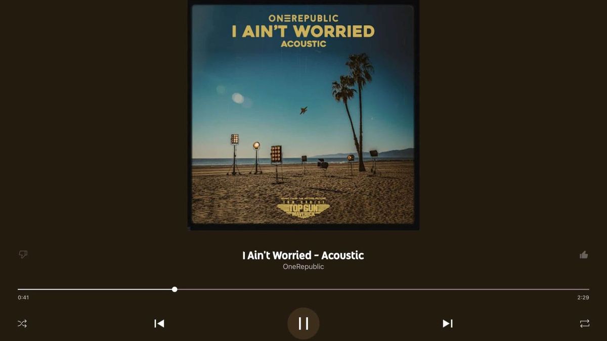
YouTube Music redesign finally comes to iPad, two years late
Landed on the iPhone last year

You may remember that the YouTube Music Android app had a redesign a couple of years back, giving it a Now Playing screen. Now that update has finally made it to the iPad, 9to5Google reports.
Delays aren't unheard of – the update took a year to reach the iPhone app. But two years is a long time by anyone's measure.
So what's new? The cover art is now enormous, and you can tap it to share what's playing, download it for offline listening or add it to a playlist. The Thumbs Up/Down sits next to the song title and artist, while below the cover art sit the playback controls.
A quick swipe up or down brings up the Up Next queue, though you can't swipe left and right to change track (as you can on Android).
Also missing is the Android app's two-column design which shows the queue next to the controls.
So, it took two years to bring this update to iPad, and it's still lacking some of its Android equivalent's features. Anyone would think the YouTube-owning Google was trying to push people to Android...
MORE:
Get the What Hi-Fi? Newsletter
The latest hi-fi, home cinema and tech news, reviews, buying advice and deals, direct to your inbox.
Read our full YouTube Music review
Then compare it with industry leaders Spotify and Apple Music
Or let us do the hard work for you: best music streaming services
Joe has been writing about tech for 20 years, first on staff at T3 magazine, then in a freelance capacity for Stuff, The Sunday Times Travel Magazine (now defunct), Men's Health, GQ, The Mirror, Trusted Reviews, TechRadar and many more. His specialities include all things mobile, headphones and speakers that he can't justifying spending money on.
