


Apple released the first developer betas for iOS 18 on Monday. These can be easily installed on any compatible iPhone, but I don’t recommend doing it on your personal phone. In this case, however, I didn’t practice what I preach and I installed the latest version of iOS on my iPhone. There’s a lot to discuss.
Apple and Icon Customization: What Happened Here?
The statement Apple made on Monday at WWDC 2024 regarding design changes was not only about the visual updates but also signifies a shift in philosophy, which I have mixed feelings about. Let’s be honest: When Apple seems to be running out of ideas, it tends to look towards Android for inspiration.
In the case of iOS 18, it seems like Apple may have looked a bit too much. One of the main new features in this version is the ability to change the color of app icons. However, in the initial beta release, the result is quite disappointing. Some might argue that it’s a beta version, and that's true. However, Android’s themed icons are also in beta.
 iOS 18 vs. Android 14. Same feature, different implementation.
So, how do they differ? Google’s approach involves creating color palettes connected to the wallpaper and then assigning a theme to the icons accordingly. The iOS implementation, on the other hand, is possibly the worst I’ve seen in years (at least, to date) when it comes to customization. The concept is similar: You can automatically set the icons to the background color or even choose the color yourself.
However, I noticed that the icons and widgets seem to blend in with the wallpaper color in a somewhat random way, without any clear design. It doesn’t seem like the icons were specifically adjusted for this. It’s not a bad idea, as Google has proven with its approach. As such, I believe that this version will improve in the future. It’s surprising to see Apple release something in this state, though, even if it’s just a first beta.
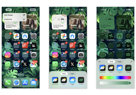
Speaking of icons, you can now place them wherever you want on the screen. There are no longer any restrictions forcing you to keep them at the top of the screen. Additionally, you can adjust the size of the icons directly from the Home Screen. When choosing the biggest size, this will hide the labels. This is simply because the large size doesn’t accommodate these labels, not because of a specific function to hide them.
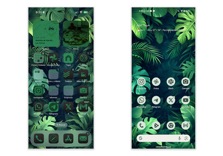
 Some apps change color. Some don’t. Others, like the App Store, maintain the same design.
There’s a new dark theme for icons, which is a great idea, but not entirely well executed. I’m not so hopeful about this one. It’s pretty obvious that colored icons have problems, but the Dark Mode implementation shows an icon-by-icon design. If you had sent me a screenshot of such icons a few days ago, I’d have thought it was a free Icon Pack from the Play Store.
It’s not so much a matter of subjective taste but, again, a plea for consistency at the UI level. Icons in Dark Mode follow a slightly different design language than when used in Light Mode.
For instance, the Mail app has a blue background and a white icon. When set to Dark Mode, the icon doesn’t go from white to black, it goes from white to a blue gradient. Why is that? The Camera app, however, has a black icon and a grey background. In Dark Mode, it has a grey icon and a black background. This does follow the white-to-black reversal pattern of a Dark Mode, as it should be.
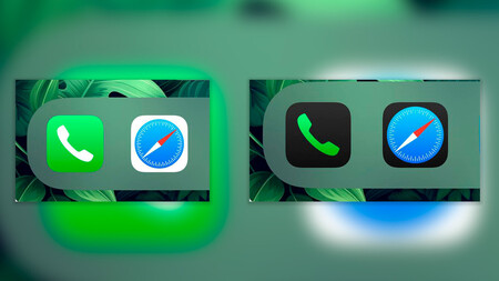
The same goes for the Phone and Safari apps. In the Phone app, the green background is used as the icon color in Dark Mode. In Safari, on the other hand, the icon stays the same while the background changes from white to black (as it should in Dark Mode). It may seem like a minor detail, but the fact that the icons change color without following a consistent pattern is quite surprising to me, especially when Dark Mode is meant to turn white to black and maintain consistency across all elements.
The New Control Center
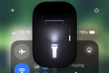 You can now specifically modify the light in the Flashlight app.
The Control Center has undergone a major redesign, and I’m thrilled with the result. There are some significant design changes, including updated icon colors, polished animations (Apple is really taking care of this in iOS 18), and new options for the flashlight. Now, you can adjust not only the flashlight's intensity, but also concentrate its direction. It’s really great.
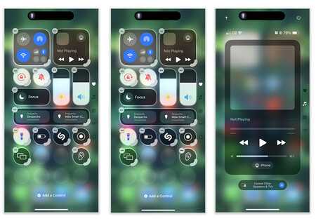
The new interface now includes four pages instead of just one. You can swipe down to access Music (for AirPlay streaming), Home, and Connectivity. In addition, you have the option to add a completely customized page and resize widgets as needed.
This is the most functional and customizable Control Center the iPhone has ever had. One small yet convenient detail is the new option to turn off the iPhone located in the top right corner when accessing the Control Center.
Hidden Apps and More Secure Face ID
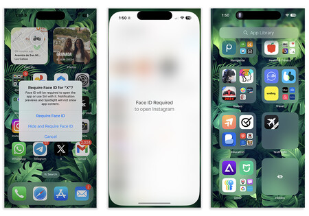
In the first beta of iOS 18, a new security feature has also been added that allows users to hide apps and use Face ID as an additional layer of security. This can be done by long-pressing on the app to lock it using Face ID. This is similar to existing functionality in apps like WhatsApp, but now it’s built into the system, providing a quick way to secure any app.
Furthermore, users will have the option to hide the icon of any app and move it to a “hidden” section in the Library. These hidden apps can only be accessed using Face ID. In essence, this feature serves as an alternative to Android 15’s Secure Folder.
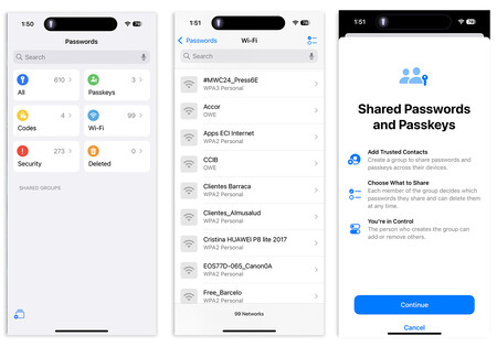
Also related to system security, Apple has introduced a new Passwords. During Monday’s keynote, I was quite surprised to see the company separated a basic function from the settings in an app. After trying it out, I now understand why.
This app provides a faster and more accessible way to keep track of all your passwords. It’s divided into six sections:
- All
- Passkeys
- Codes
- Wi-Fi
- Security
- Deleted
Additionally, you can create shared passwords and access keys from here.
Changes in Apps and What Apple Didn’t Tell Us
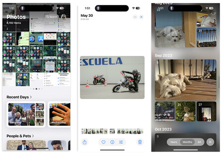
The key update in the apps involves the Photos feature. It has undergone a complete redesign, but it still falls short compared to alternatives like Google Photos in terms of organization.
When you access Photos, you’ll see the gallery at the top and the new collections at the bottom. These collections include recent days, people and pets, custom collections (you can create as many of as you want), memories, trips, albums, and featured photos.
Apple may have intended to organize the content more effectively, but the scrolling is still quite long. The preview of photos has changed visually, now being displayed in slightly smaller squares with rounded corners. This looks good visually, but the images appear smaller until you click on them.
I appreciate the way Apple has organized search by years and months, with highlighted memories as the cover. However, don’t expect options to delete items from photos or use AI search because Apple Intelligence isn’t active yet.
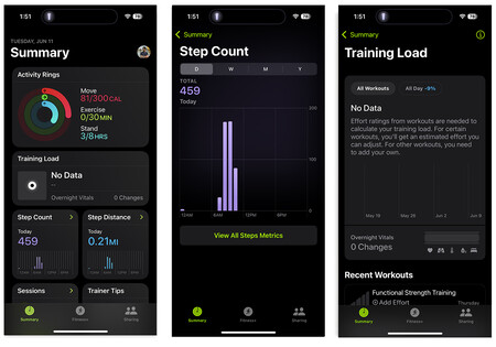
I was pleasantly surprised to see how well the Fitness app has been updated. The new user interface now separates the number of steps taken and the distance traveled. Additionally, by incorporating the vital signs data from the Health app, we can calculate the training load associated with these metrics.
After completing a workout, the Apple Watch prompts you to input your perceived effort. By combining this information with the data from its sensors and the measurements from the Health app, the watch provides you with insights into your training load.
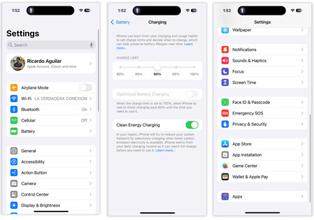
Moreover, the Settings app has undergone a major change. The Settings are no longer presented as an endless list. Instead, the Apps settings are now grouped into a single category. Important options such as Battery have been moved to the top of the Settings. Additionally, there’s a significant option that Apple didn’t mention in its presentation: Users can now limit the iPhone’s charging percentage. This feature allows users to protect the battery by preventing it from charging to 100%, which isn’t the healthiest thing for the battery. Users can choose the percentage at which they want the iPhone to stop charging from the Settings app.

A Great New Version With a Lot of Work Ahead
iOS 18 is expected to be a game-changer for Apple. Although there are some issues with the user interface and not all the new features have been released yet, this system will set the stage for Apple’s foray into AI. As of now, Siri’s capabilities are still quite limited. However, next year, it’ll be integrated with GPT-4o to handle queries that OpenAI can handle better than Apple.
The upcoming features include AI-powered summaries of notifications, contextual analysis of the phone screen, integration of generative models, and more. The most exciting aspect of iOS 18 isn’t where it’s at right now, but what it’ll become in the future.
Image | Apple
View 0 comments