TechRadar Verdict
With a nice robust design and innovative family features the Amazon Fire tablet is great for kids, but with a poor screen, lack of some core apps and confusing user interface it's not for everyone.
Pros
- +
Family friendly
- +
Sturdy design
- +
Fantastically cheap
Cons
- -
Poor selection of apps
- -
Questionable OS design
- -
Dated screen
Why you can trust TechRadar
Whereas even two years ago tablets in various shapes and sizes were still selling like hot cakes, global sales have taken a turn for the worse of late. Even Apple, virtual founder of the form factor, has been feeling the pinch – and Amazon is no Apple.
Manufacturers are increasingly targeting the budget end of the market with a slew of polycarbonate slates for the masses, of which Amazon's £50 (US$50) Fire is the latest example; indeed the tablet is so cheap and cheerful that the e-tailer is selling it in multi-packs – buy five and get a sixth free!
Amazon is trying to be everything Apple isn't, and reach every nook and cranny that Cupertino hasn't. While Apple is preaching to the high-end converted, Amazon is setting its sights on every tablet-deprived Tom, Dick and Harry.
At such low price points the big question, of course, becomes: what about quality? If spending £399 (US$499) or more on a tablet guarantees a smooth user experience, a machined glass and metal body and class-leading specs, what compromises will inevitably be encountered in the budget knock-off?
Design
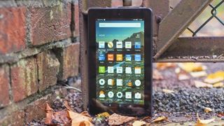
The Amazon Fire tablet looks rather like one of those prototype slates you occasionally see in blurry screenshots taken in foreign labs – and in the hand it feels much the same as you suspect one of those devices might.

In short, everything that the iPad is, the Amazon Fire is not.
Although the rough-hewn polycarbonate feels nice in the hand, and the device feels reassuringly substantial, there's a distinct air of the unfinished about the Fire, and this is certainly noticeable in the button placement.
Aside from the very easily missed microSD slot on the right side of the slate, there's nothing of note on three of the four sides of the Amazon Fire tablet.

That means on top the volume rocker, 3.5mm headphone jack, micro USB port and power button all jostle for position, in what is a particularly confusing design choice.
The VGA front-facing camera sits above the 1024 x 600, 7-inch screen while on the back is the 2MP rear-facing camera, some subtle Amazon branding and the rear-firing speaker.
In the dark, trying to find the correct button to press was a little frustrating, and I often found myself fumbling around for far too long.

These days, although there is some variation, general trends in button placement exist as a result of design evolution, and Amazon's decisions in this regard are a little baffling.
Overall, the Amazon Fire looks unassuming, and uninspiring. You probably won't mind if you're watching video or browsing the web in bed, but whip it out on the train and it won't be turning any heads. Then again, at £50 (US$50) it doesn't need too - you're getting what your paying for.

Display
Screen technology has progressed in leaps and bounds since the appearance of the earliest tablets and smartphones.
As little as five years ago, resistive touchscreens were still in use, and now we have the likes of the gorgeous QHD AMOLED panel on the Samsung Galaxy Note 5 to dazzle us.
And as technology has trickled down to the budget end of the market, 'bad' screens have largely ceased to exist as designers adopt the discounted tech of yesteryear.
That being said, there is what might be considered an acceptable limit to the age of the tech chosen, and in the case of the Fire that limit may have been breached.

With its resolution of 1024 x 600 the Fire has around 171ppi, which on a screen this small isn't exactly great. Pixellation of text is noticeable, even when coming from a 720p screen, making reading an experience that isn't exactly pleasurable – and certainly not on a device that's expected to double as an e-reader.
Watching video isn't a spectacular experience either. HD video content is obviously beyond the capabilities of the device, but existing in the strange hinterland between 480p and 720p doesn't benefit the Fire.
It isn't all bad news, however. Viewing angles are decent and the screen appears to be fairly evenly lit, and adequately bright when required.
On the other hand, colour reproduction isn't exactly inspiring, with tones appearing rather dull and muted, and visibility in bright sunlight isn't very good.
For the price it's difficult to fault the quality of the screen on the Fire, and yet there's no escaping the fact that offerings from Asus and others offer far better quality for just a little more money, especially heavily discounted tablets like the Memopad 7.
Sean is a Scottish technology journalist who's written for the likes of T3, Trusted Reviews, TechAdvisor and Expert Reviews.

